top of page
Beru
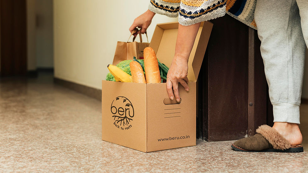
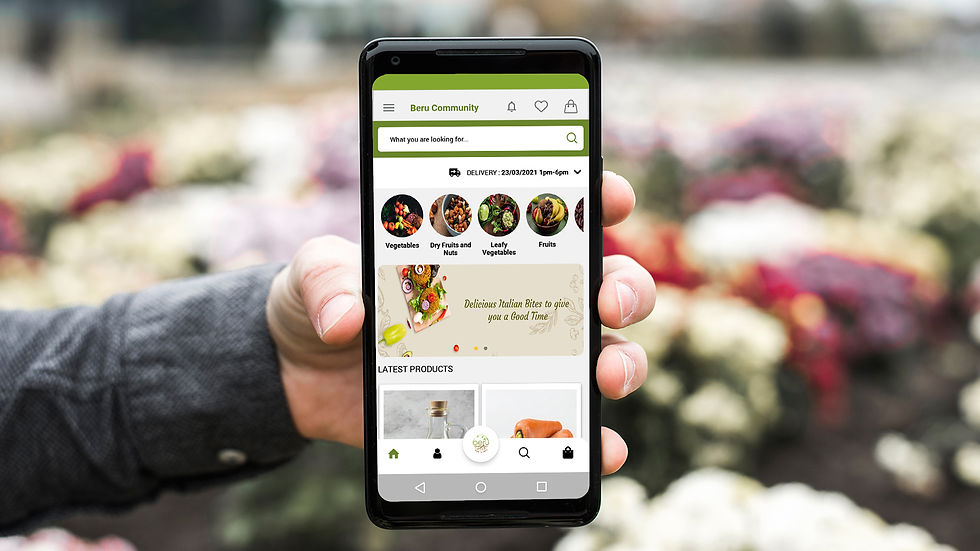
Beru is a natural farming platform that offers agribusiness solutions to farmers and establishes market access for their produce.
Beru is a Kannada word and its meaning is 'Root' in English. The logo concept for Beru - Back to Roots embodies the essence of its mission: a circular typography forming a tree branch extending from the letter "U" in "Beru" to represent growth and sustenance, while the letter "r" roots downwards, symbolizing a return to traditional farming practices. This design signifies a harmonious connection between nature and agriculture, reflecting Beru's commitment to empowering farmers and fostering organic farming practices in India. Through this logo, Beru communicates its dedication to providing agribusiness solutions, promoting market access for farmers, and delivering fresh, chemical-free organic produce to communities.


Incorporating a blend of vibrant green and brown colors into the logo design would enhance its visual impact and further reinforce the natural and organic ethos of Beru - Back to Roots. The use of varying shades of green can evoke feelings of growth, freshness, and harmony with nature, aligning perfectly with the organization's mission.
For the tree branches and leaves, deeper shades of green can be employed to symbolize strength, resilience, and abundance. These darker tones can be used to create a sense of depth and dimensionality within the typography, enhancing its visual appeal.

BRAND IDENTITY DESIGN
Other projects


Works


bottom of page